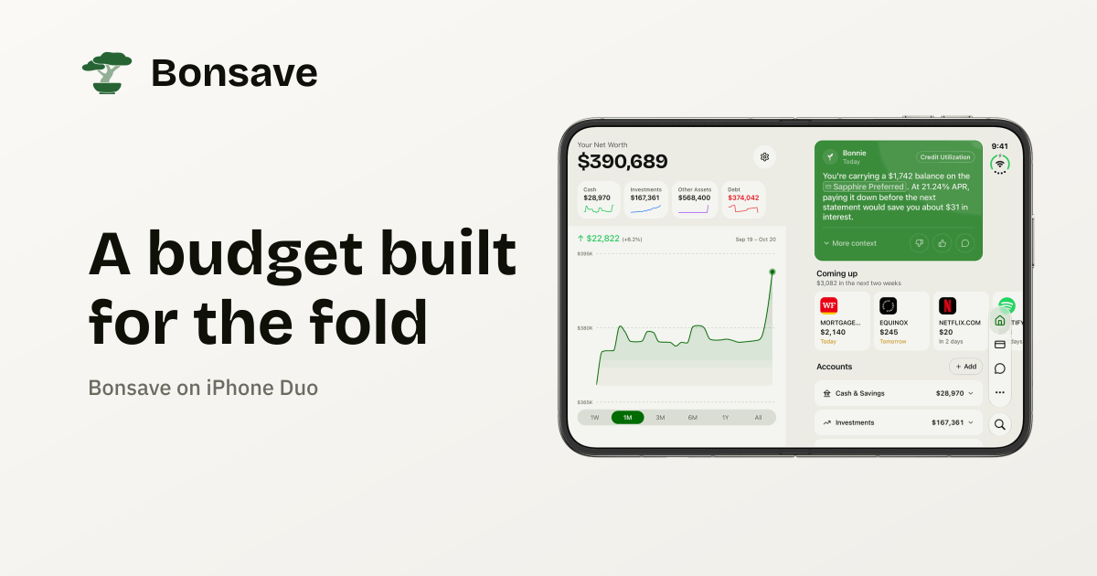
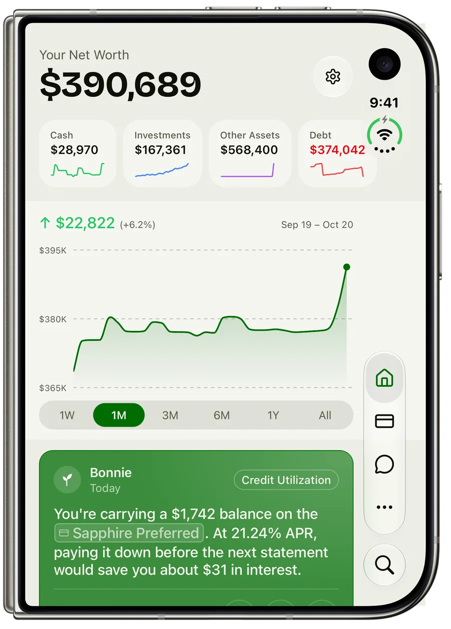
If you’re looking for a budgeting app made for the iPhone Duo, Bonsave is one. Full disclosure: I built it, so weigh this accordingly. When you unfold the phone, the app splits into two columns that meet at the fold. Your chart stays on the left, and the details scroll on the right.
When I searched in late October 2026, I couldn’t find another budgeting app that says it supports the Duo. A few have “Duo” in their names, which makes the search results funnier than they are useful. That doesn’t prove there are no others. Plenty of developers ship things without announcing them, so I’ll give you a way to check any app yourself further down.
Why does a bigger screen matter for budgeting?
Budgeting is mostly comparison. You look at what you’ve spent, then at the category that caused it, then back at the total to see if it matters. On a regular phone, those things live at different scroll positions, so you spend the whole time going up and down, like someone checking a recipe in the next room.
The inner screen on the Duo fixes that, but only if the app does something with it. A wide screen showing one stretched column gives you the same information with more margin. The useful version keeps the summary still while you work through the details.
What Bonsave looks like unfolded
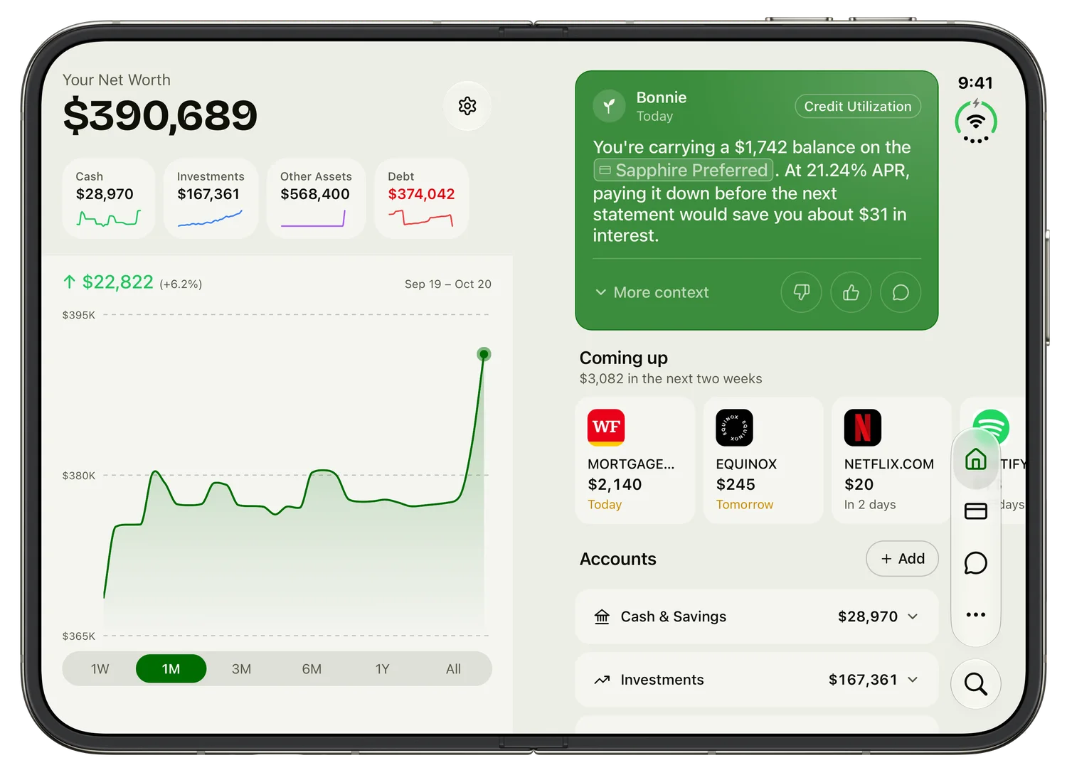
Open Bonsave on the inner screen and your net worth sits on the left, with its chart running to the bottom edge. Today’s insight from Bonnie, your upcoming bills, and your accounts are on the right.
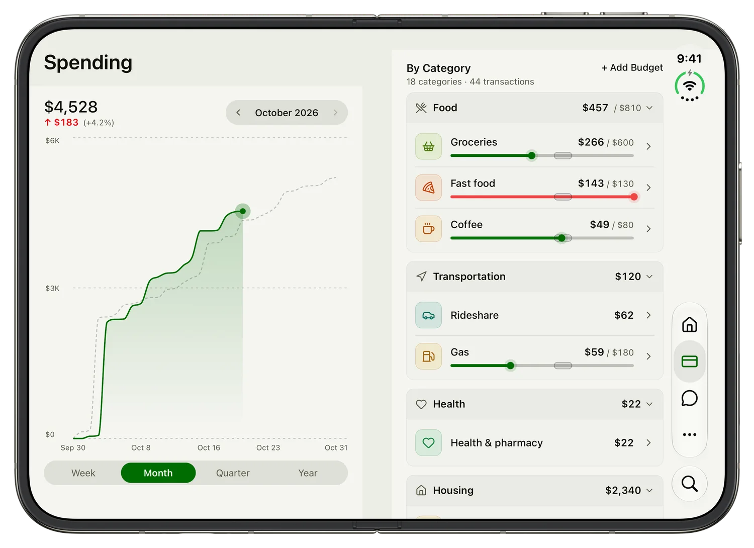
On Spending, the chart of the month stays put while you go through each category on the right, so you can see a budget bar and the month’s total at the same time.
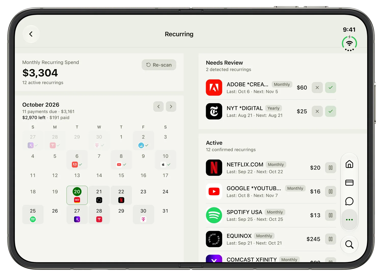
Recurring charges get a calendar on the left and the full list on the right. That makes “why is the end of this month so expensive?” a quick question to answer.
Here’s how the main screens divide:
| Screen | Left of the fold | Right of the fold |
|---|---|---|
| Home | Net worth and its chart | Insight, upcoming bills, accounts |
| Spending | The month’s chart | Categories and budgets |
| Investments | Portfolio value and its chart | Allocation and biggest positions |
| Projections | Your projected net worth | Financial independence date and your plan |
| Recurring | Calendar of bills | Full list of subscriptions |
The pattern is the same everywhere: the left column tells you where you stand, and the right column lets you dig in. Once you’ve learned it on one screen, you know it on all of them.
How it handles the fold
I based the layout on Apple’s iPhone Duo tech talks, which turned out to be more useful than my own instincts. Four decisions came out of that:
Nothing runs across the crease. Charts, summaries, and cards each stay inside one column, so no number ever sits in the groove.
The left column doesn’t scroll. My first version let both columns scroll together, which left empty space under the chart. Now the left side stays fixed and fills the screen, and only the right side moves.
Long lists stay full width. Insights, search results, and Settings don’t split. Apple’s guidance is that a continuously scrolling list shouldn’t contort itself to avoid the fold, and it’s right. A list you read top to bottom has no second column to offer.
Folding doesn’t restart anything. Close the phone on the Spending screen and you’re still on Spending on the outer display, with the same rows open. The layout rearranges around what you were doing instead of reloading it.
What about the outer screen?
Folded, the Duo works like a regular phone, and so does Bonsave: one column, in portrait. That’s still the right way to check a balance in a checkout line.
How to check whether a budgeting app really supports the Duo
Apple says apps optimized for the phone carry a “Made for iPhone Duo” badge in the App Store, so look there first. Then install the app and spend two minutes on these:
- Unfold it on a spending screen. Can you see a summary and the details at once, or is it one column with bigger margins?
- Look at the crease. Does a chart or a number run through it?
- Fold it partway through something. Are you still on the same screen, with what you had open?
- Scroll a long list. Does it behave like a list, or has it been chopped into columns for the sake of it?
That’s a better test than any feature page, including mine.
Is Bonsave the right budgeting app for you?
Maybe not. Bonsave tracks spending against category budgets, and it’s built around seeing your whole financial picture: net worth, investments, retirement projections, and daily insights from Bonnie. If you want every dollar assigned to a job before you spend it, you’ll be happier with a zero-based budgeting app like YNAB. I wrote up the best YNAB alternatives if you’re weighing the two approaches.
One limit worth knowing: I built and tested these layouts on Apple’s iPhone Duo simulator, and I haven’t tested Split View, where the Duo runs two apps side by side. If something looks wrong on your phone, I’d like to hear about it.
Try it
The iPhone Duo layouts are in the current version of the iOS app, so there’s nothing to turn on. Pro is $7 a month after a 14-day free trial. If you want to look around first, the web demo needs no account, though you’ll have to imagine the fold.
iPhone is a trademark of Apple Inc., registered in the U.S. and other countries.